![OP+US [オーパス]](https://op-us.jp/wp/wp-content/themes/barecity_op-us/images/opuslogo.png)
BijouxGAOKA

-
https://op-us.jp/wp/wp-content/uploads/bijouxgaoka_001.pnghttps://op-us.jp/wp/wp-content/uploads/bijouxgaoka_001-640x420.pnghttp%3A%2F%2Fimg.youtube.com%2Fvi%2F%2F0.jpgBijouxGAOKA / LOGO / OP+US


-
https://op-us.jp/wp/wp-content/uploads/bijouxgaoka_002.pnghttps://op-us.jp/wp/wp-content/uploads/bijouxgaoka_002-640x420.pnghttp%3A%2F%2Fimg.youtube.com%2Fvi%2F%2F0.jpgBijouxGAOKA / LOGO / OP+US

-
https://op-us.jp/wp/wp-content/uploads/bijouxgaoka_003.pnghttps://op-us.jp/wp/wp-content/uploads/bijouxgaoka_003-640x420.pnghttp%3A%2F%2Fimg.youtube.com%2Fvi%2F%2F0.jpgBijouxGAOKA / COASTER / OP+US
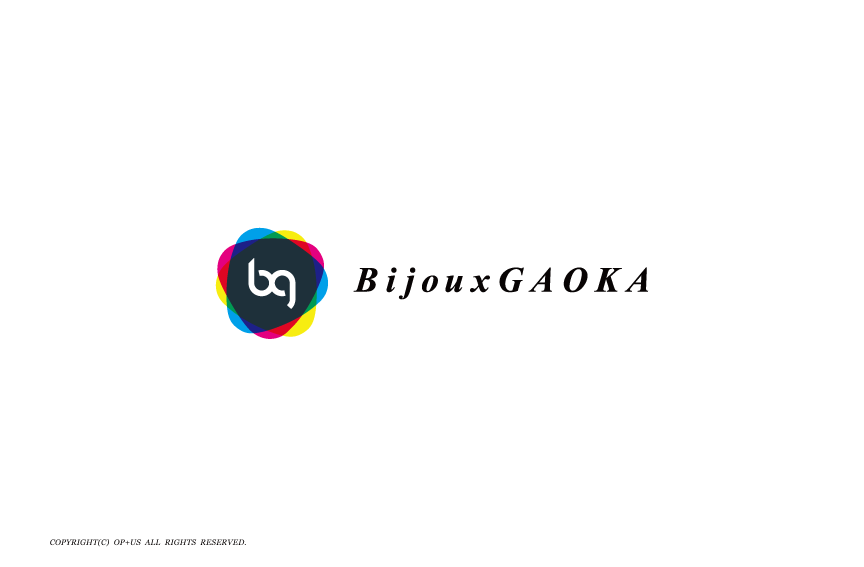
We created the emblem and the logo for BijouxGAOKA.
Assuring that the event will be held at the headquarters at Jiyugaoka, which is a peaceful place that will bring serenity throughout the party that will pursue “Real Beauty” which makes it so inviting to all professionals from different field.
Conceptualized on putting Bijoux(jewel) and GAOKA(Jiyugaoka) together, polishing a “aesthetic sense”.
– Concept of the logo –
We express by using three colors of changeable triangles to express various human curiosities which define “possibility, connection and aesthetic sense” beyond that.
People of all ages asserts that this is a place of precise beauty with security and curiosity.
BijouxGAOKA(美自由が丘)のシンボルマーク、ロゴタイプを手掛けました。
ゆったりとした時間が流れる自由が丘を活動拠点とし、毎回異なる分野からプロフェッショナルを招き〝本物の美〟を追求する会。
Bijoux(宝石)とGAOKA(自由が丘)を組み合わせ〝審美眼〟を磨くことをコンセプトに活動しております。
– ロゴコンセプト –
人が持つ様々な好奇心を3色の流動的なトライアングルで表現し、その先にある「可能性」「繋がり」「審美眼」を表現しました。幅広い年齢層の方々が、安心感と好奇心を持って、美を的確に見極める場であることを象徴しています。
Credits:
Creative Director : Kensuke Kato
Art Director : Kensuke Kato
Graphic Designer : Kensuke Kato
Producer : Kensuke Kato
Creative Boutique : OP+US


